Wout's Bloemenshop – Brand Design
Wout's Bloemenshop is a charming local flower shop in Utrecht, known for its cozy and inviting atmosphere. The brand style reflects the natural, organic essence of flowers while conveying warmth and approachability. A rustic yet elegant aesthetic was chosen to mirror the natural beauty of flowers while maintaining a refined, timeless feel.
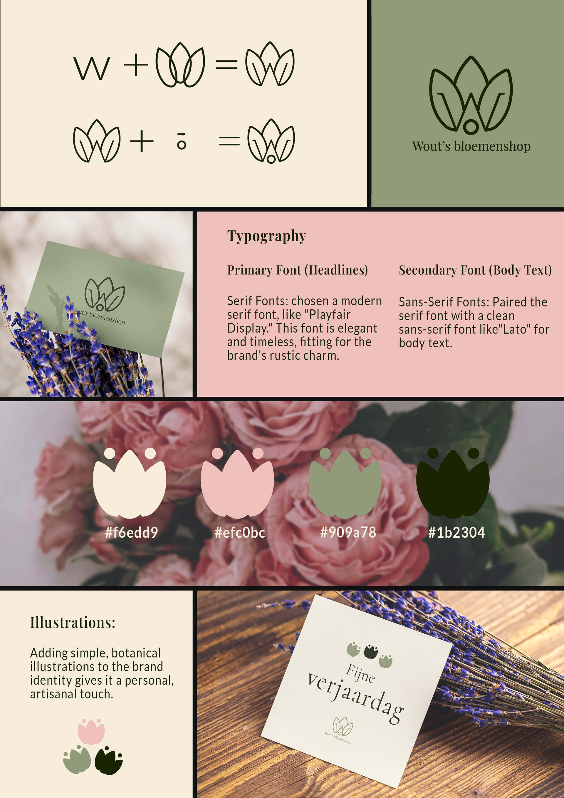
Logo Design
The Combination Mark style was selected as the best option for Wout's Bloemenshop, providing flexibility to use the text and icon together or separately, depending on the medium. The logo symbol combines a "W," representing the first letter of the shop's name, with a flower shape. Designed with attention to detail, it aligns with the typography of the Playfair Display font to create a cohesive and sophisticated brand identity.
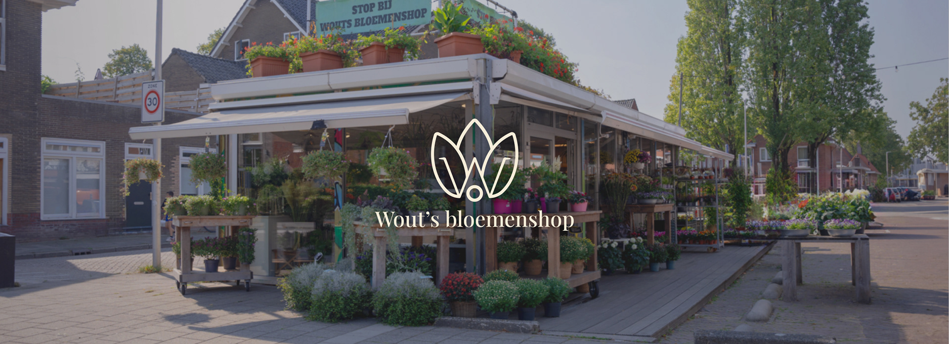
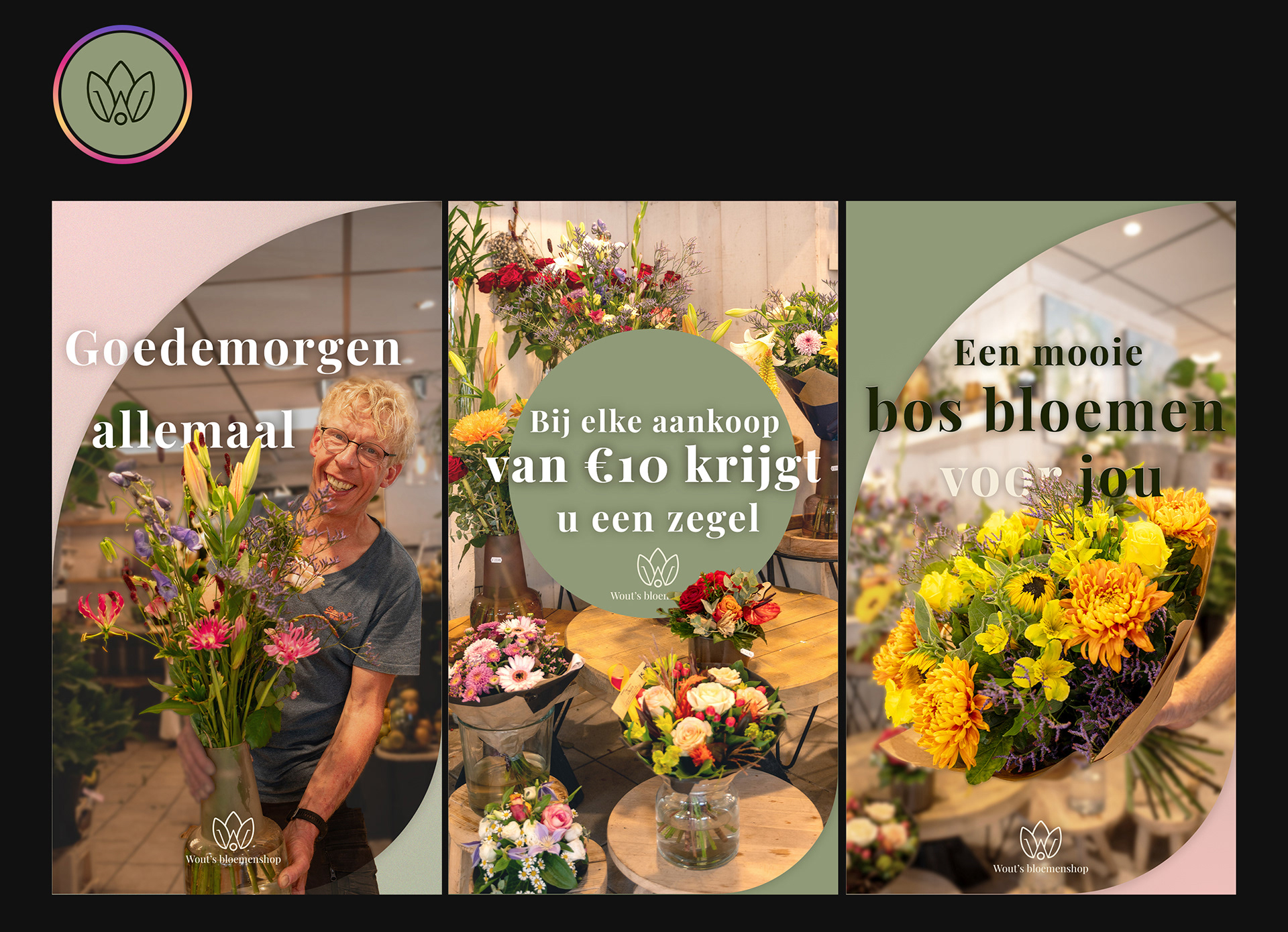
Social Media Banners
The social media banners were designed to foster a friendly connection with customers, provide information about the store, and engage them with content related to flowers and shop processes. One of the banners specifically aims to create a more personal and welcoming customer interaction.
Business Cards
Two business card designs were created for Wout's Bloemenshop. One is a folded card offering a discount to customers who make more than 20 purchases. The second card serves as a contact and information card for customers who wish to learn more about the shop.